Rethinking navigation for the Native app
Discovery, strategy, and design for a navigation overhaul.
Project Overview
I led the redesign of Leafly's mobile app navigation, shifting it from a feature-led structure to one centered on what users are trying to do.
After a reorg left the Native team without a PM, I shared product ownership with the Engineering Manager, defined the strategy, and took the work from discovery to a shipped MVP in June 2026.
The full vision became the North Star for Native navigation. The MVP fixed the most pressing user problems first, with every change designed as a step toward that vision.
Role
Senior Lead Product Designer (shared PM responsibilities)
Team
Leafly’s Native team
Timeline
December 2025 – June 2026
Platforms
iOS and Android
Results
Adopted as the North Star for Native navigation; MVP shipped June 2026.
Background
A new direction, and a gap to fill
In late 2025, a new CEO joined Leafly and the company restructured. I moved from the Web team to the Native app team, where the previous Product Manager had recently left.
App usage had been stagnant and slowly declining for months. Product leadership asked the Native team to develop ideas and a roadmap aligned with the company's new direction.
I partnered with the Native Engineering Manager to define the roadmap, taking on product responsibilities alongside design: shaping it, prioritizing problems, and aligning stakeholders. After reviewing user feedback together, we agreed that before adding anything new, we needed to strengthen the app's foundation, starting with navigation.
The Problem
Key tools were tied to specific screens instead of being available where users needed them.
User feedback revealed four recurring frustrations, all stemming from navigation.
The bottom nav disappeared when users went deeper.
It only appeared on the five main tab screens. Once users opened a product, dispensary, or strain page, the nav was gone, and getting anywhere else meant backtracking.
Profile was hard to reach
Profile lived only in the Home header, so reaching account settings from anywhere else meant going back to Home first.
Search took too many steps.
Search sat inside the Browse tab and took three taps to reach. It was available, but not at the moment users’ intent was strongest.
Changing your address meant leaving the map.
The Map screen had no address selector. Users had to return to Home, update their location, and find their way back, turning a one-tap task into a detour.
Why it mattered
With app usage stagnant and slowly declining, every extra step was a reason users left. Leadership wanted people to discover products and strains more quickly, but the navigation made them have to search for the basics. Fixing it was a prerequisite for growth.
Design Challenge
How might we restructure the app's navigation around what users are trying to do, so search, profile, and location are within reach from anywhere, while supporting both shoppers and users who come to Leafly to learn about strains?
The solution also had to fit the team's time and resources, and keep the brand's strain content front and center.
Research goals
Understand how users actually navigate the app today and which tabs they rely on most.
Identify what users come to the app to do, and whether the navigation supports those goals.
Learn how leading shopping, delivery, and product-discovery apps structure their navigation.
Validate whether an intent-based navigation is clear and predictable for real users.
Approach
1. Analyzing navigation data
I started with 2025 bottom nav data to see how people actually moved through the app. Browse, the app's search tab, accounted for half of the 21.3M navigation taps across iOS and Android.
Inside Browse, more than 9 in 10 visits skipped the shortcuts below the search field. When users did tap one, Shop accounted for 74% of shortcut taps, followed by Deals at 21% and Doctors at 5%.
2. Reframing the problem: feature-led vs. intent-based
The data pointed to a structural issue: our navigation was feature-led, with each tab representing a product feature or section and receiving equal weight, regardless of how users treated it. This structure mirrored the company's organization and was easy to build and extend, but required users to figure out which feature matched their goal.
3. Learning from other apps
I reviewed six apps across three categories: delivery and shopping (DoorDash, Instacart, Uber Eats, Walmart), a direct competitor (Weedmaps), and product discovery (Vivino), a useful parallel for a strain database.
The strongest apps kept search prominent, let users change location from anywhere, and let user goals shape the navigation.
4. Building a framework
To design against user intent, I grouped goals into three modes and mapped each tab to one.
Explore: "What's out there? Help me decide."
Target: "That. I want that."
Repeat: "I'll get this again."
5. Exploring directions
I designed multiple concepts, ordered from lightest to boldest. All shared a prominent search bar, an address selector, and a cart at the top, and Profile in the bottom nav.
Every concept removed Strains from the bottom nav. My reasoning: users rely on strain information in every mode, so it should be woven throughout the app rather than limited to one tab. Putting it in the nav would be like Spotify adding an "Artists" tab.
6. Selecting a direction with leadership
I shared the concepts with the Senior VP of Product, the VP of Product, Content & Marketing, and the Director of Design. Leadership chose Concept C to test, with one change: Strains returned to the nav.
Their reasons were brand identity, since strain data is what many users know Leafly for, and users in states where cannabis isn't legal, who can't shop and come to the app for strain information. The tested nav became Discover, Shop, Map, Strains, and Me, with Deals moved into shortcuts on Home.
7. Usability testing
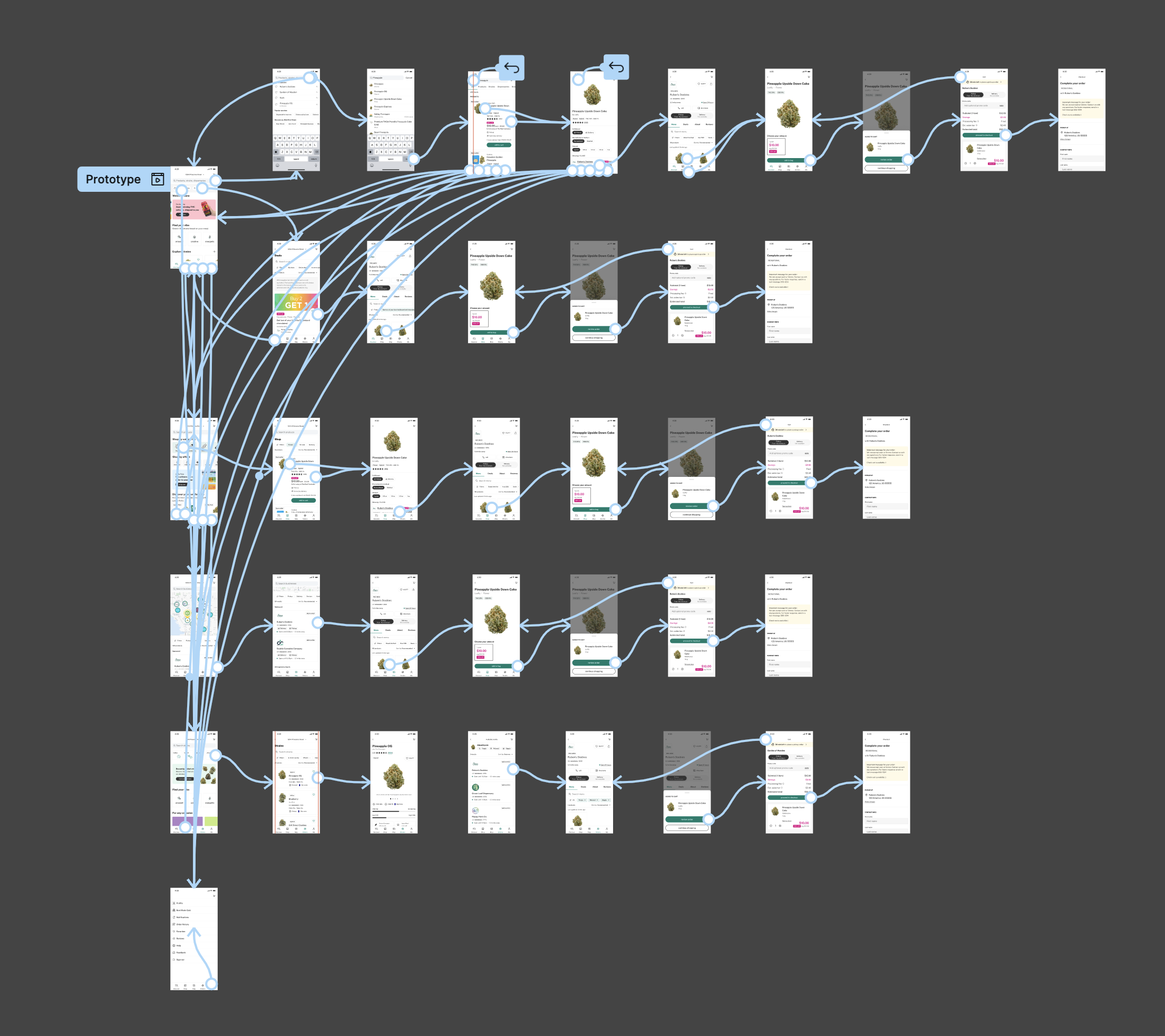
I built and ran an end-to-end prototype covering Search, Discover, Shop, Map, Strains, and checkout. On March 16, 2026, I conducted unmoderated UserBrain testing with 8 participants.
Key insights
1. Users arrive with intent, and search is how they act on it
The 2025 data showed that Browse drove half of all navigation, and in testing, most participants started with the search bar rather than browsing promotions or categories.
2. Shopping intent was already there, just buried
Shop was the top shortcut inside Browse, yet shopping had no direct place in the original nav.
3. The intent-based framework worked
Participants described the nav as intuitive and fast, predicted where each tab led, and went straight to the Me tab for orders, favorites, and reviews. Modules like "Find your vibe" and "Strain collections" supported open-ended exploration.
4. Strains is a destination for part of our audience
Leadership's feedback showed that for users in non-shopping markets, strain information isn't content woven into other modes. It's why they open the app.
5. Discover and Shop didn't need to be separate
The biggest usability issue was overlap: both tabs showed similar product content, and participants couldn't tell them apart. This led to the long-term vision of a single Home that blends discovery and shopping, personalized for each user.
6. Category browsing needed to be higher
Participants relied on category shortcuts for products like vapes and edibles, but the tiles sat too low on the screen.
Results
A North Star and a lighter first step
Leadership embraced the work as the North Star for Native navigation, praising the framework's organization and creative direction. They chose to begin with an MVP and phase the work into the North Star over time. The decision came down to two factors: time and resources, and a desire to further test the combined discovery-and-shopping Home before making a major product change.
What was shipped
Strains stayed in the nav, protecting the brand and serving non-shopping markets. Deals moved out of the nav and onto dispensary cards and Search, where users make decisions. And lastly, Browse was renamed to “Search”.
Impact since launch
Since launch, the new navigation has given every core action a consistent home: profile, search, and location are now reachable from any screen. We're tracking search engagement, profile visits, and address changes from the Map against 2025 baselines to measure impact and guide the next phase toward the North Star.
Reflection
Owning product decisions changed how I design.
Sharing PM responsibilities meant asking not only "what's the best design?" but "what's the right problem to solve first, and what can we ship?" Partnering with the Engineering Manager taught me to weigh user needs, business goals, and team capacity together.
Hold the vision firmly, but the details loosely.
The Explore / Target / Repeat framework held from concept through testing. My assumption about Strains didn't, and the navigation is better because leadership pointed out an audience I had underweighted.
Recommendations
Every MVP change was chosen as a step toward the North Star. The next steps:
Build global search
Once search is available across the app, the temporary Search tab can be removed.
Test the combined Home
Validate a Home that blends discovery and shopping.
Improve personalization
Recommend products, strains, and deals based on each user's activity.
Add category shortcuts
Bring Shop by category to Home.